Data → visual intelligence
See what your data
is trying to say.
Turn complex data into clear charts, maps, and analysis. Find the detail that makes the difference.
Built for people who work with data.
- Analysts & consultants
- Universities & researchers
- Public institutions
- Business & operations
A view for every question
Charts, maps, and tables.
Follow a trend, compare regions, or see how the pieces connect. Open any example in the editor.
Growth contribution
WestMarket performance
USDDatamon Motion
Give change a timeline.
Animate observations over time, mark the moments that matter, and export a video.
Explore all 41 visualization types
Change over time
Follow a trend or compare periods.
Comparison
Compare sizes across categories.
Relationships
See how measures move together.
Ranking
Put values in order and spot leaders.
Distribution
Find the spread, clusters and outliers.
Parts & flows
Show composition and movement.
Geography & detail
Explore places and underlying values.
Inside Datamon
From the first row
to the final figure.
Import your data. Choose a view. Make it yours.
One workspace, all the way to export.
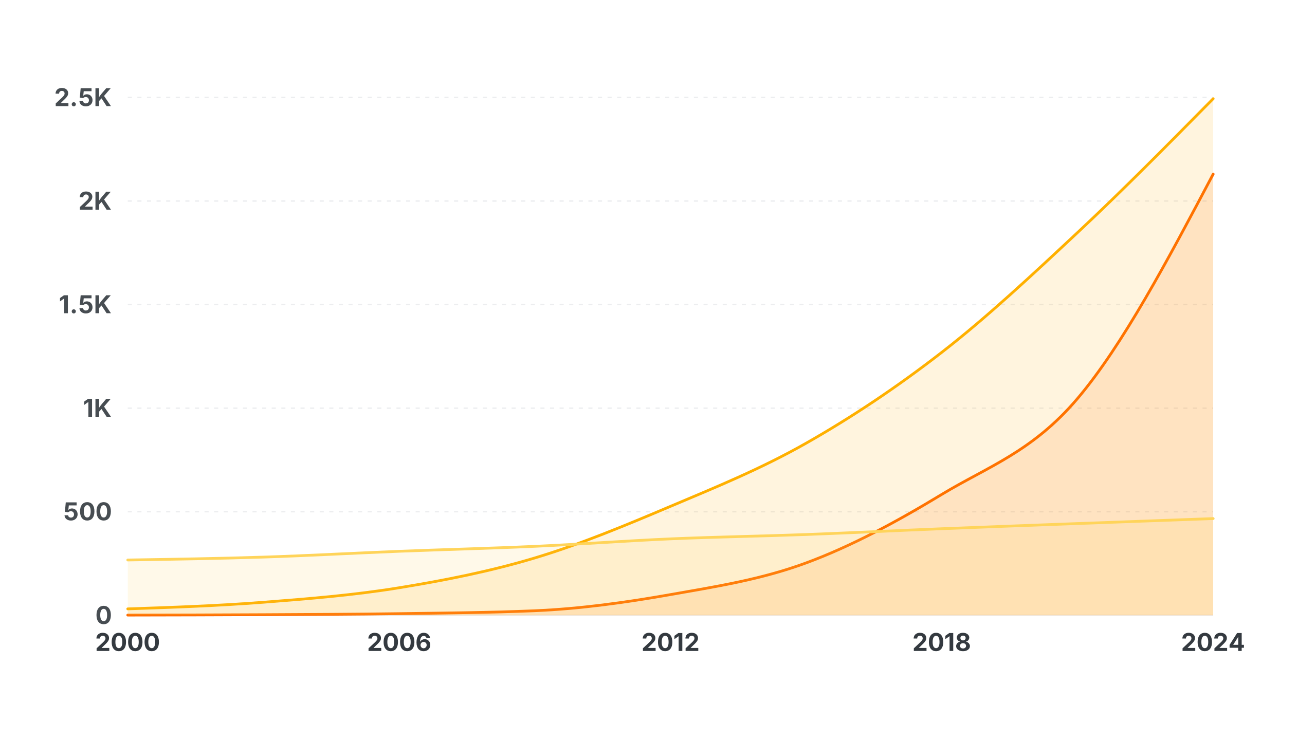
Data → Visualize → Refine → Publish
Ask Datamon
Ask your data
a better question.
Find the drivers behind a change. Compare groups, inspect a relationship, and turn the result into a visual you can edit.
- Understand trends and relationships
- Calculate and inspect the result
- Preview changes before applying them
Find the contribution behind the trend.
Run either question to inspect the calculation and open the result as an editable chart.
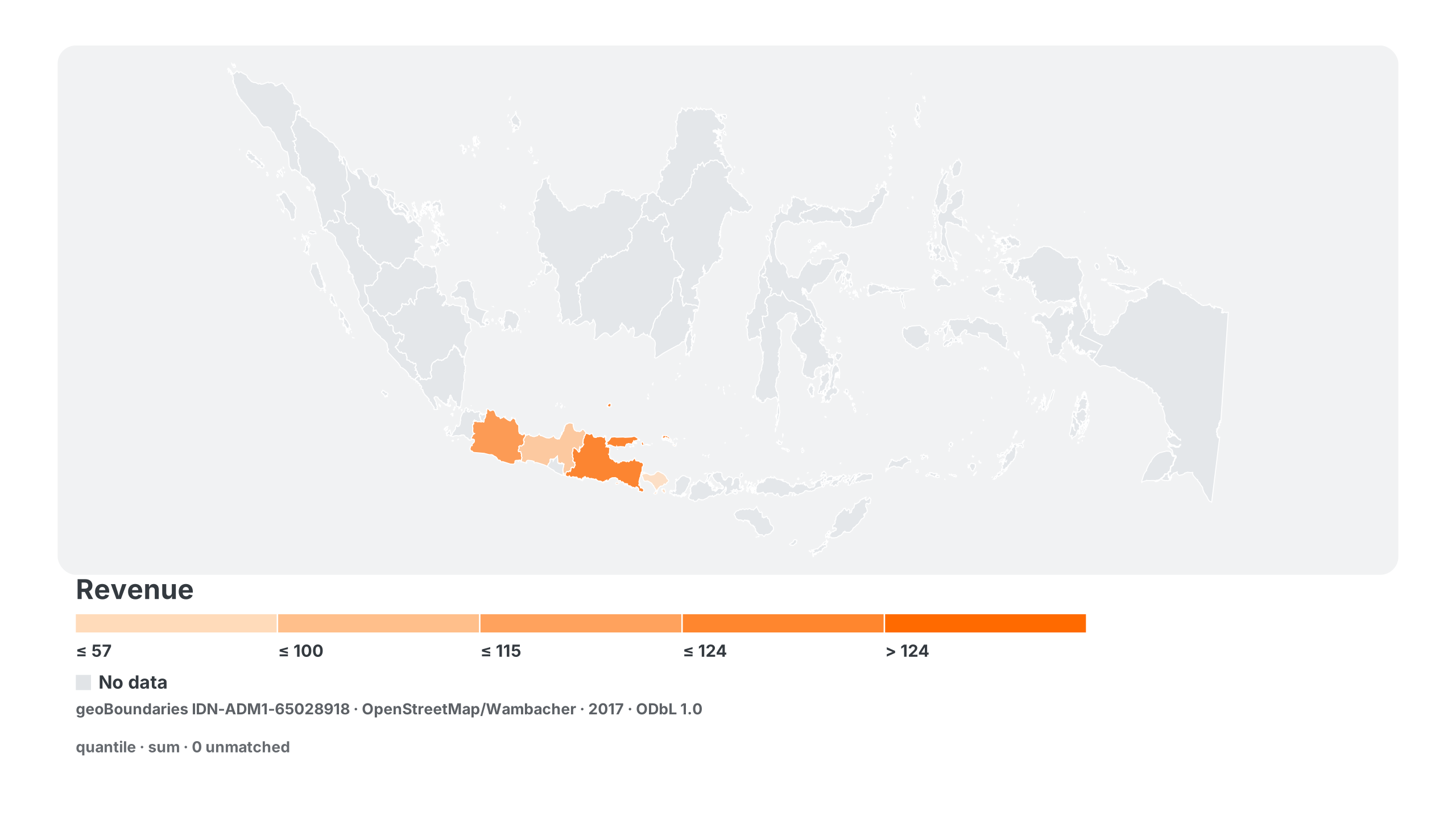
Geospatial analysis
Go from rows
to regions.
Match geographic data to real boundaries. Compare places with maps, meaningful legends, and the underlying values in reach.
Business, research & public data
Make the decision.
Show the reasoning.
Pair a clear visual with the detail that makes it useful: values, units, methods, and sources.
Business & finance
Revenue and margin, together.
 Open the financial example
 Research & government
Inspect the relationship.
 Open the research example
 Illustrative datasets. Keep source notes with your figure. Correlation describes association; it does not establish causation.
Ready for the next conversation
Create in Datamon.
Present anywhere.
Export a figure for your report, a slide for PowerPoint, or an interactive web version.
 PNGHigh-resolution images
 SVGEditable vector graphics
 PDFFigures ready for print
 WebInteractive links & embeds
Your workspace.
Your next insight.
Datamon is not an open-source project.
Browser projects stay on this device. AI and cloud analysis use server services. Publishing shares the chosen data.
How your data is handledA useful starting point.
Editable examples for research, business, and public data.